Branding a truly Albertan energy resource company from the ground up Read More
Project Index
(Click to jump)
Brand Identity
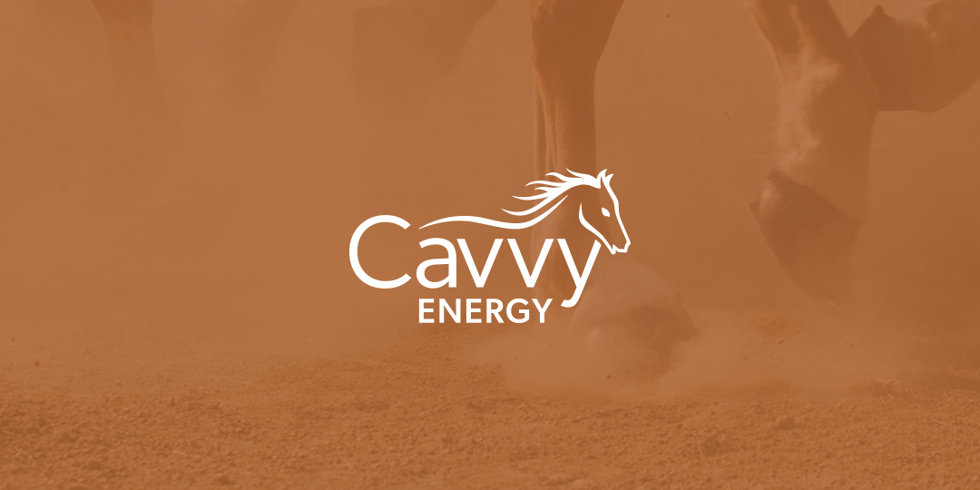
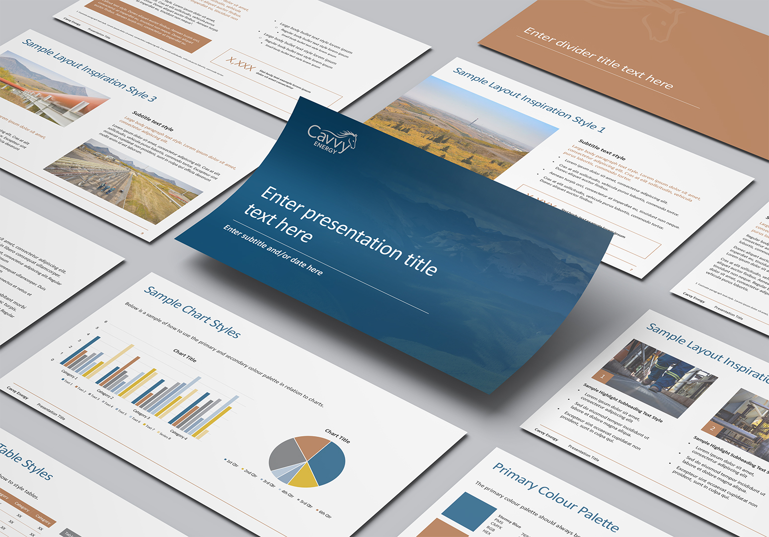
Inspired by Alberta’s ranching heritage, the name Cavvy Energy speaks to a tradition of strength, reliability and skilled execution. The logo features a hand-drawn horse woven through the wordmark, reflecting care and connection to the land. Traditional typography adds warmth and familiarity, grounding the brand in Western values.
Our process
- Exploration and research phase with insights collected into a Discovery Report
- Planning and brand development phase with recommendations collected into a Strategy Report
- Name exploration and development
- Logo, brand design and development of a Graphic Standards Guide
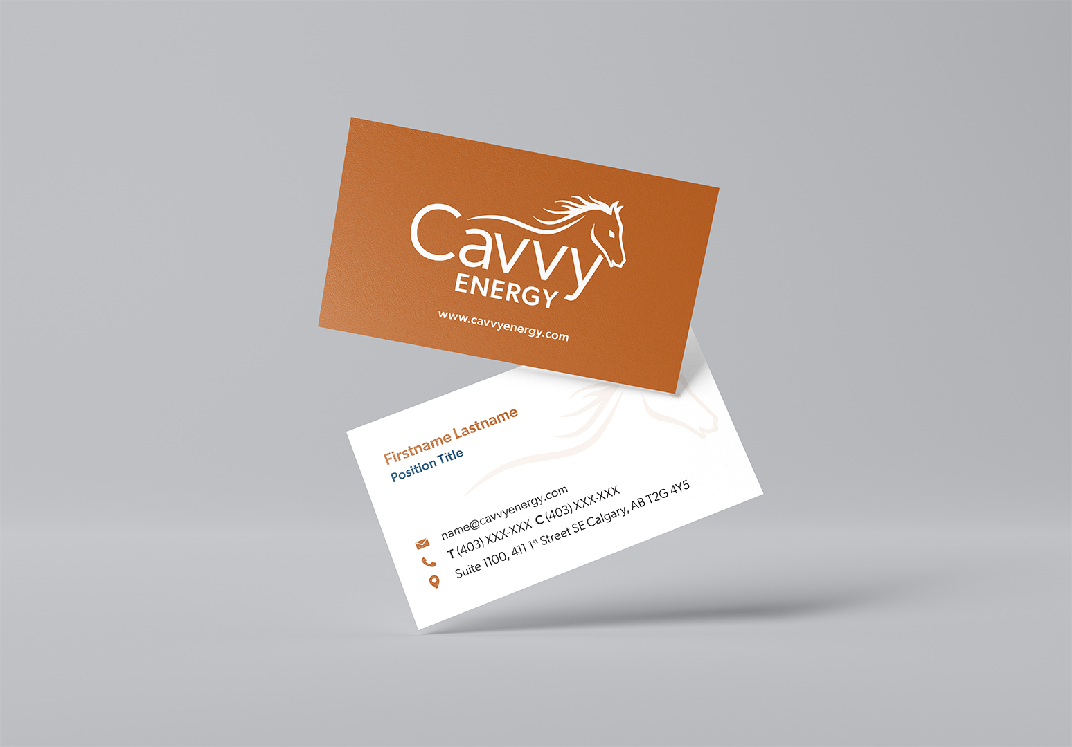
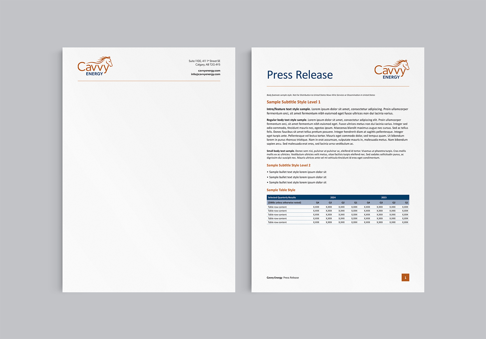
- Branded marketing materials, including stationery, email signatures, tradeshow banners and presentations
Concept Exploration
The development of concepts was rooted in themes of hard work, natural landscapes, grit and horses. A large selection of initial concepts were developed, brought to life from black and white sketches to full colour digital.
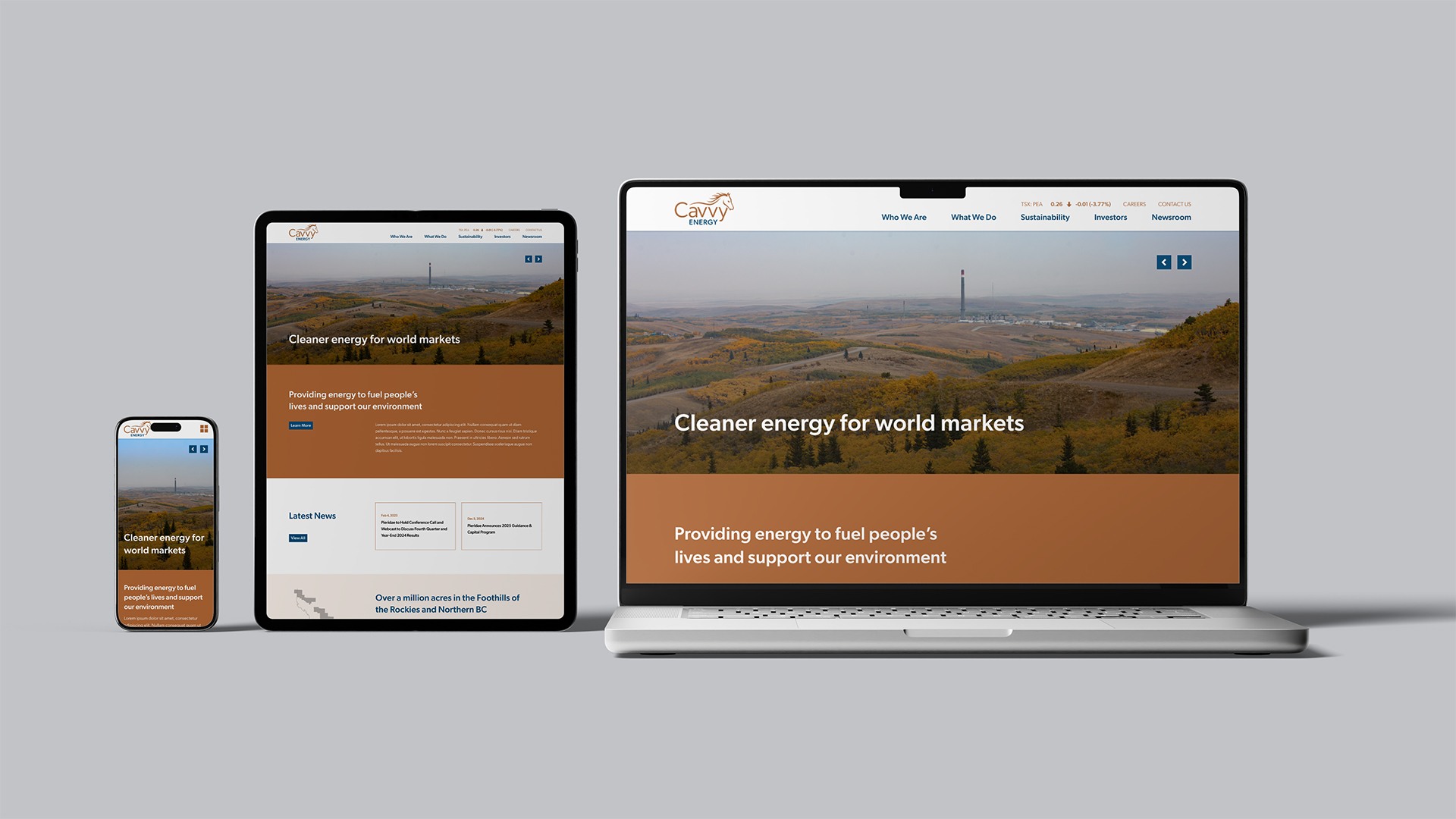
Website Design
Cavvy Energy was brought to life in the digital world through a new custom website to match the brand. Simple, streamlined navigation with a secondary task bar simplified the user experience, while large photography and custom design content blocks draw the user in to explore the site.