Bringing recognition and awareness to one of Alberta’s unique travel destinations Read More
Project Index
(Click to jump)
Brand Identity
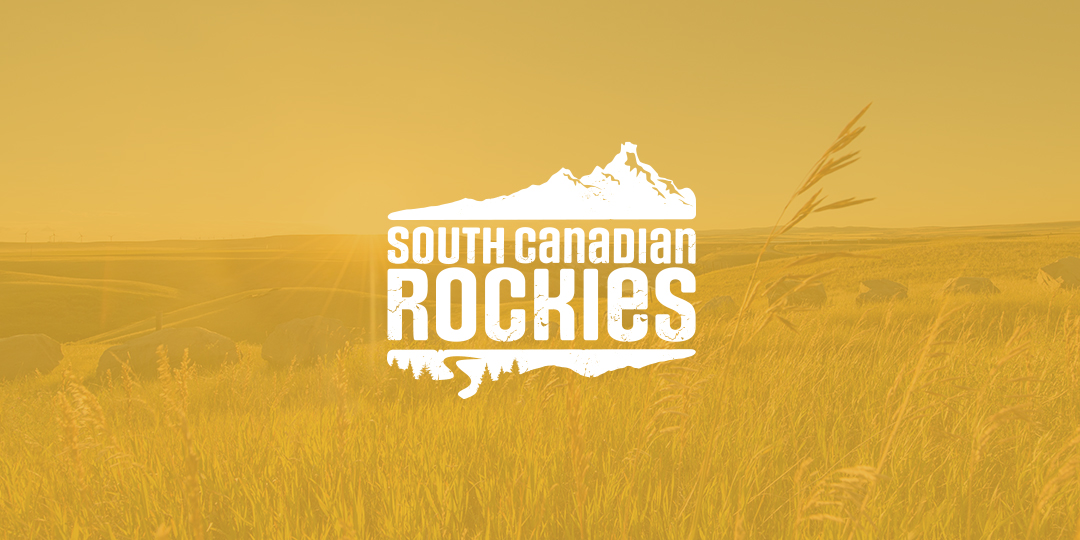
Rooted in place, the South Canadian Rockies' identity draws from key geographic markers of a flowing river and a mountain form. The main mark is rugged and natural, balancing detail with clarity. A rich and varied colour palette is inspired by natural elements of the area – blue, green, yellow, red and grey come together to represent the vast land within the South Canadian Rockies.
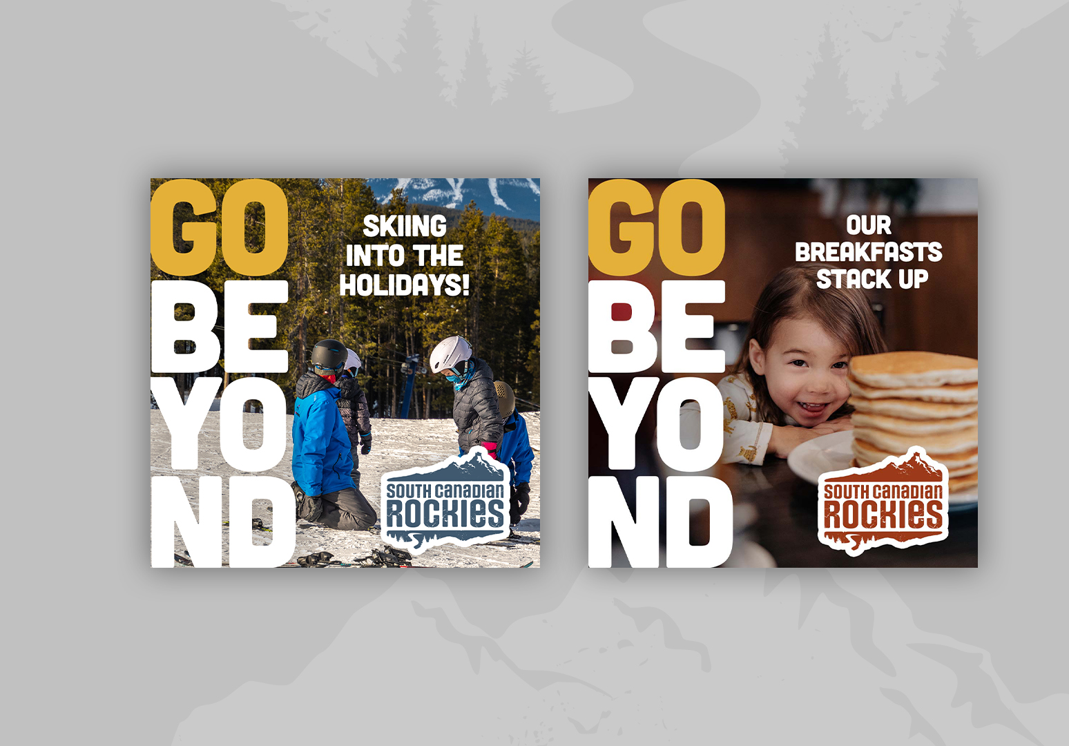
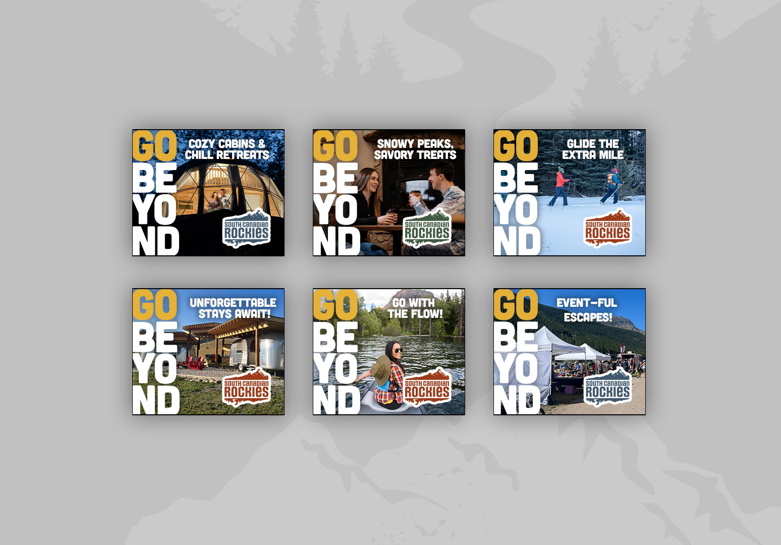
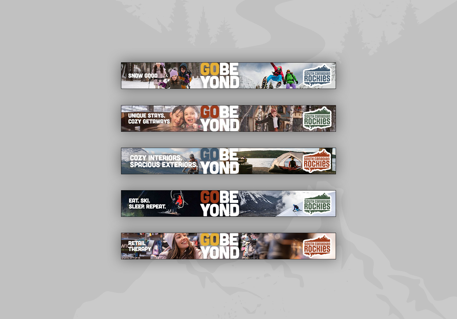
Go Beyond Campaign
Since 2021, we’ve led a long-term, evolving campaign to position the South Canadian Rockies as a destination that exists beyond traditional mountain parks — untamed, largely unexplored, and rich with adventure. Through seasonal digital advertising in both summer and winter, the campaign has consistently aimed to drive users to the South Canadian Rockies website and encourage overnight stays and longer visits in the region.
Campaign Tactics


By staying adaptable and collaborative, the campaign continues to strengthen awareness of the South Canadian Rockies and position it as a must-visit destination for those seeking authentic, lesser-known mountain experiences. Over the past four years, the campaign has reached millions of impressions and continues to evolve year after year to reflect new regional needs, audience insights and partnership opportunities.